
A beautiful sequence that could sell anything has not solved the ad. An ad makes one specific offer matter to one specific audience and leaves them knowing what to do next. That is decided before any picture is made. Below are two ads Bald Rhino’s agent made for the same online Mandarin school, from its link and one screenshot of its page. Same brand, same colours, same 15 seconds, but two audiences, two reasons to care and two different actions. They play on one clock: compare what each moment is doing.
- The promise 0:00 你好! Want Chinese that actually stays with you?
- The experience 0:04 Live one-on-one lessons with a certified teacher.
- Made for them 0:08 Built around your goals and your schedule — and you speak from lesson one.
- The action 0:12 Book your trial at eachtone.com.
- Who it's for 0:00 Teaching Mandarin?
- The friction 0:02 Stop building every lesson from scratch.
- The product and its proof 0:04 Get ready-to-teach materials from a certified teacher with eleven years of experience.
- The action 0:10 Browse them at eachtone.com. 一起教中文吧!
1. Settle the brief before the picture
Before choosing images or a style, know what the ad is selling and to whom. You don’t need a form; a rough wish is enough to start, and a good collaborator asks a few questions and suggests answers. These are the decisions that shape everything after them:
| Decision | What to settle |
|---|---|
| The offer | What is it, and what concrete benefit can be shown? Which claims, prices or credentials are true? |
| The audience | Who needs it, in what situation, and what do they already know? Is the buyer the same person as the user? |
| The action | What should they do: book a trial, buy, sign up, visit a page, remember the name? Where does that happen? |
| Where it runs | Which platform, format, length and language? One bilingual ad, or a version per language? |
| The identity | Logo, colours, type, the product’s real shape and packaging, screenshots. What must stay exact, and what can be redesigned? |
| The treatment | A demonstration, a presenter, motion graphics, a filmed or generated scene? Narration, dialogue, music or silence? |
A link alone rarely settles the look. Reading a page gives its text, not its design: not the logo file, the colours, the photos or how the interface moves. Send a screenshot or the brand files with the link. The EachTone ads took their colours, typefaces, logo and numbers from one screenshot of the school’s home page; the text alone gave only a few lines.
2. Give each audience its own reason
A student booking lessons and a teacher buying materials want different things, so they need different proof and a different action. Rushing both into one 15-second ad serves neither. Look at the two ads above beat by beat. The student ad opens on the desire (Chinese that stays) and proves the experience: a live lesson with a certified teacher, built around their goals. The teacher ad opens by naming its audience, names the friction they know (building every lesson from scratch) and proves the product. Each ends on its own action: Book your trial and Browse them.
Open on a desire, a friction, a surprise or a result your product answers, make the product recognisable as that idea develops, show the useful change, and end on an action the viewer understands. This is a way of reasoning, not a fixed three-scene template: a quiet premium reveal and a comic demonstration need different pacing.
3. Make the benefit visible
What counts as proof depends on what you sell:
- A lesson or a service: show the experience or its useful result, like a learner trying a phrase and getting specific feedback, or a teacher opening a real lesson resource. Invented worksheets prove nothing; use real samples, or make it clear the picture is an illustration.
- Software: follow one concrete interaction. Someone asks for something, the product answers, and the result becomes visible. The Bald Rhino ad below does this: each typed request opens into the scene, the images, the voices or the music it produced. Show what the viewer would ask and what they would get, not a list of features.
- A physical product: establish its shape, material, scale and the detail that sets it apart, then show the action that explains its appeal. In this bakery ad that is the croissant torn open and the knife through the crust. Use a photo of the real product as the identity reference when generating a better hero shot, then check that the label, shape and proportions survived.
- The product, up close 0:00 Baked at dawn.
- Its material 0:04 Crust that sings.
- The range 0:08 Sweet, every day.
- The brand 0:12 Golden Crumb Bakery. Fresh from the oven, every morning.
Generation cannot supply proof the product doesn’t have: a performance figure, a testimonial or a result has to be real. Keep exact logos and small print as overlays added in the edit, where they can’t be misspelled.
4. Choose how to make it after the brief
The person chooses the experience; the tools follow from it. Typography, an interface demonstration or a diagram are motion graphics. Product photography and hero shots come from an image model with the real product as reference. A real spokesperson or demonstration is recorded; a generated performance or scene comes from a video model. Narration needs a cast voice, and the score, effects and mix need their own pass. Each extra method should solve a specific problem in this ad: a second voice or a new style is not an improvement by itself. The guides on images with Nano Banana, scenes with Seedance and music and sound cover those passes.
5. Make voice, words and picture land together
Choose narration on purpose; a music-only ad should be a decision, not a default. For a language service, a short, natural switch of language can demonstrate the offer, as the student ad’s opening “你好!” does. Decide which language leads, what needs translating, and whether you are making one bilingual ad or one version per language. Don’t cram two full scripts onto one screen.
When several languages share one picture, each narration has to fit the same moments. This ad’s English and Portuguese versions share one animation: its on-screen words were translated, and each narration was cut into sentences and placed on the same moments. Switch the language while it plays:
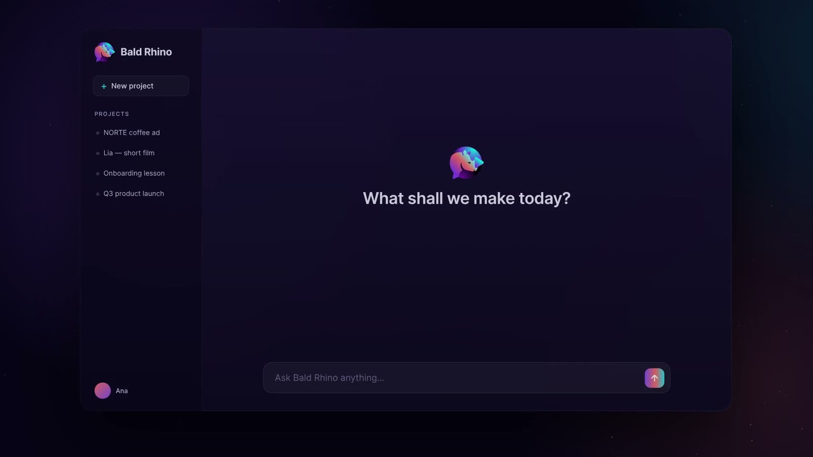
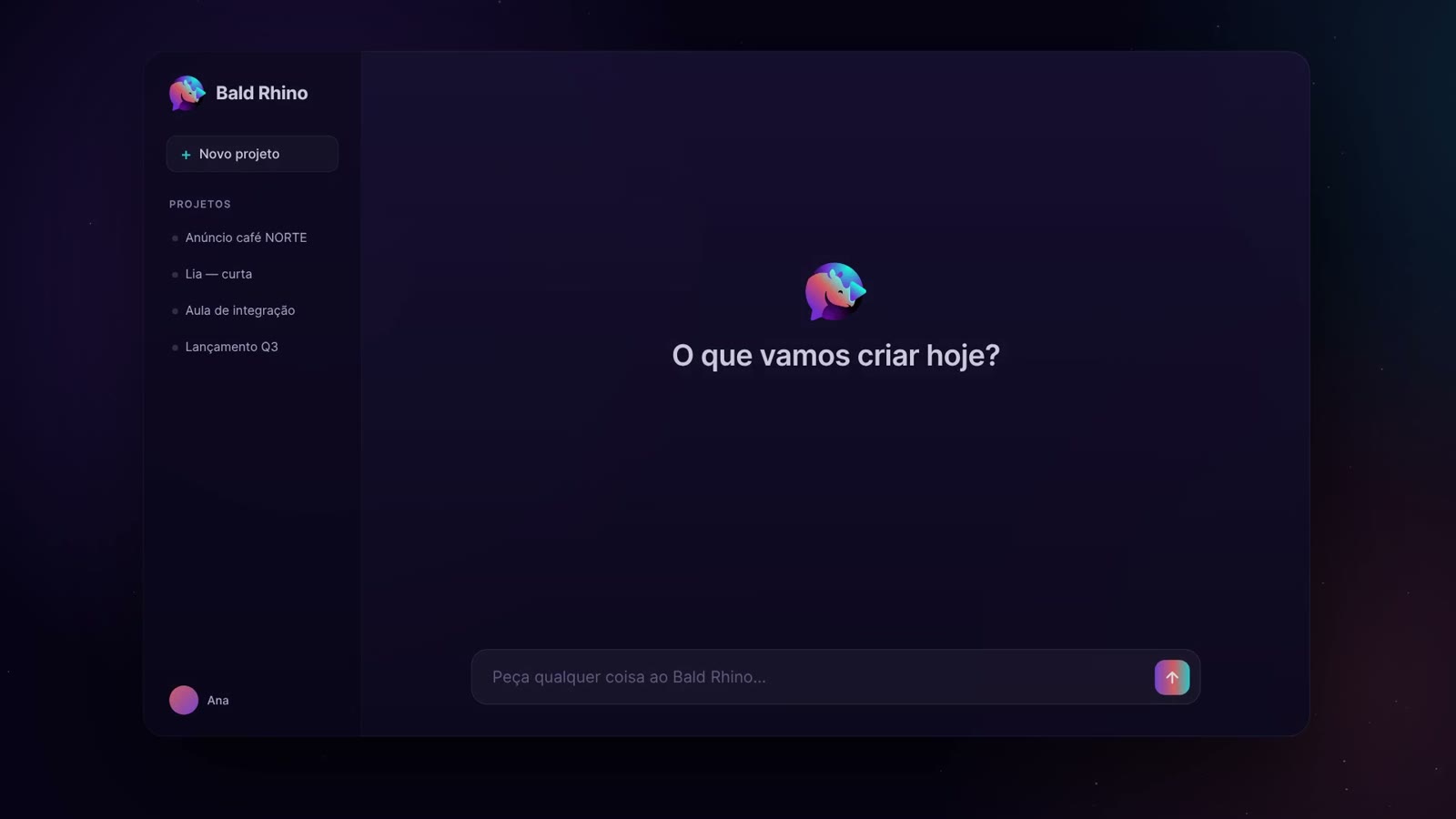
Time the design to the voice you accepted: the product action, the stressed word, the headline and the sound cue should support the same moment. Keep the music under the voice so every word is clear. Captions need time to be read, contrast, and space of their own away from the headline, and translated copy may need different line breaks and timing. Test the brand name, any word that can be read two ways and every language switch in a short voice test before the full read: a written “live” can be spoken as in “live lessons” or as in “I live here”.
6. Check the whole ad before it runs
Check the promise, the product shown, the audience, the language and version, the spelling of the brand, the destination and the call to action together, in the actual video. Watch it with the sound off as well as on, since many people will. Look at transitions and captions in motion, especially where the voice was changed. A technical check doesn’t prove the ad persuades, that a word was pronounced right, or that it will perform; those need people. For variants, keep the accepted body and assets and make the difference between versions explicit.